The Party’s in the Back
Hitting The Armory Show this season was a full-circle moment. It’s been thirty years since Colin de Land, Pat Hearn, Matthew Marks, and Paul Morris first launched The Gramercy International Art Fair at the Gramercy Park Hotel. Fifteen of those years I spent working the art fair circuit, with my introduction being at the 69th Regiment Armory on Lexington Avenue in 1999, when the Gramercy Art Fair was renamed The Armory Show after the 1913 exhibition (also known as the International Exhibition of Modern Art). Working that first art fair with 303 Gallery, I instantly took to the raw, renegade staging of it all. Hanging works was like trying to install inside a house of cards with walls essentially made of fiberboard stapled to thin wooden beams. A big part of the curation was choosing pieces that wouldn’t pull those damn things down. While New York’s gallery scene outside the fair was fiercely territorial, there was a charming sense of community within the fair, everyone nervously fumbling about, borrowing tools from each other. It was a vibe; all these forward-thinking dealers powering their art ship into battle.
The art fairs got bigger and more exciting every year. We started doing Basel in Switzerland; Miami Basel debuted in 2002, and Frieze kicked off their fair in London in 2003. Amanda Sharp, one of the co-founders of the Frieze Art Fair, was a regular in the 303 circle. While brainstorming the launch, she asked for my input on any challenges I had experienced doing art fairs. I said, “Please make stronger walls!” And sure enough, they did. This year, at the 30th anniversary of The Armory Show—after it was coincidentally purchased by Frieze last year along with Expo Chicago—it seems those fortified walls have now become an empire.
Many of the works featured in this year’s fair were large-scale portraiture and figuration, reminiscent of the influence of artists Mickalene Thomas, Ellen Gallagher, Kerry James Marshall, and perhaps Alice Neel. The works were painted, sculpted, sewn, collaged, and glittering. Identity, community, and culture were vibrantly at play. More Black artists, openly queer artists, and Native American artists are represented. Photography and video installation were largely dormant except for a few scatterings, but there was a decent amount of obsessively constructed textural work, most of it evocative of the costumes you might see on Björk.
I saw some beautiful prints in the editions area. At Paragon Press out of London, there was an apocalyptic Grayson Perry etching, The American Dream, illustrating a map of the United States being attacked with an intricate array of battleships, airplanes, helicopters, zeppelins, and missiles, representing the present-day culture war taking place online through social media and advertising. It adequately portrays the inside of my brain every day for the past few years. Tamarind Institute, based in Albuquerque, New Mexico, featured a radiant twelve-color lithograph by Los Angeles-based artist Jarvis Boyland. His intimate portraits of queer Black men in domestic settings explore the complexities of identity. Stippled with deconstructed anxiety, his conveyance of flesh, pattern, and environment rattles like an alluring sea of flicker discs.
I was haunted by Khalif Tahir Thompson’s painting, Scratch, on the outer edge of the Zidoun Bossuyt booth. Portraying a father with two sleeping children in a subway car, Thompson’s work deals with the psychological complexity of narrative and identity by chronicling lived and imagined experiences, exploring notions of self through the scope of race, sexuality, and spirituality. He states, “This work essentially examines my interest in seeing and understanding the likeness and lived experience of people.” The joy and sophistication of this work lie in its openness, allowing you to find your own story within it—an incredibly generous artistic gesture. In contrast, the installation felt too tightly packed, especially as the paintings are all similar in size. The display could have used some breathing room or shifts in scale, as each painting is strong enough to stand on its own.
Devan Shimoyama engaged my inner Club Kid at Kavi Gupta with his heavily embellished Self Portrait As Ronnie, which uses a wide range of materials. Despite its elaborate, ornamented quality, there’s still a quietness that occurs, a passivity. The figure’s jeweled eyes convey melancholy, and there’s a ghost-like quality to the face that lingers beneath all the drag—a sense of disappearance and retreat, poignant and mysterious. Shimoyama’s work has been appropriately exhibited against the Ladies and Gentleman series in Cry, Baby at the Andy Warhol Museum.
Kwesi Botchway’s work made appearances at Vielmetter and Maruani Mercier. Based in Accra, Ghana and initially influenced by Ghanaian street art, his recent works blend European painting techniques with African Realism, owing significantly to the pioneering work of Kerry James Marshall. However, compared to Marshall and the aforementioned artists, Botchway’s figures appear more guarded and maintain a detached majesty. The subject seems to know they are being viewed and scrutinized, but will not honor such intrusion. His perhaps metaphoric use of mirrors in the compositions suggests a rejection of performing for the white gaze, implying deflection as well as duality, while yielding a double portrait. His use of color and pattern is well-chosen and highly effective, especially in the extraordinary treatment of highlights reflecting off the skin.
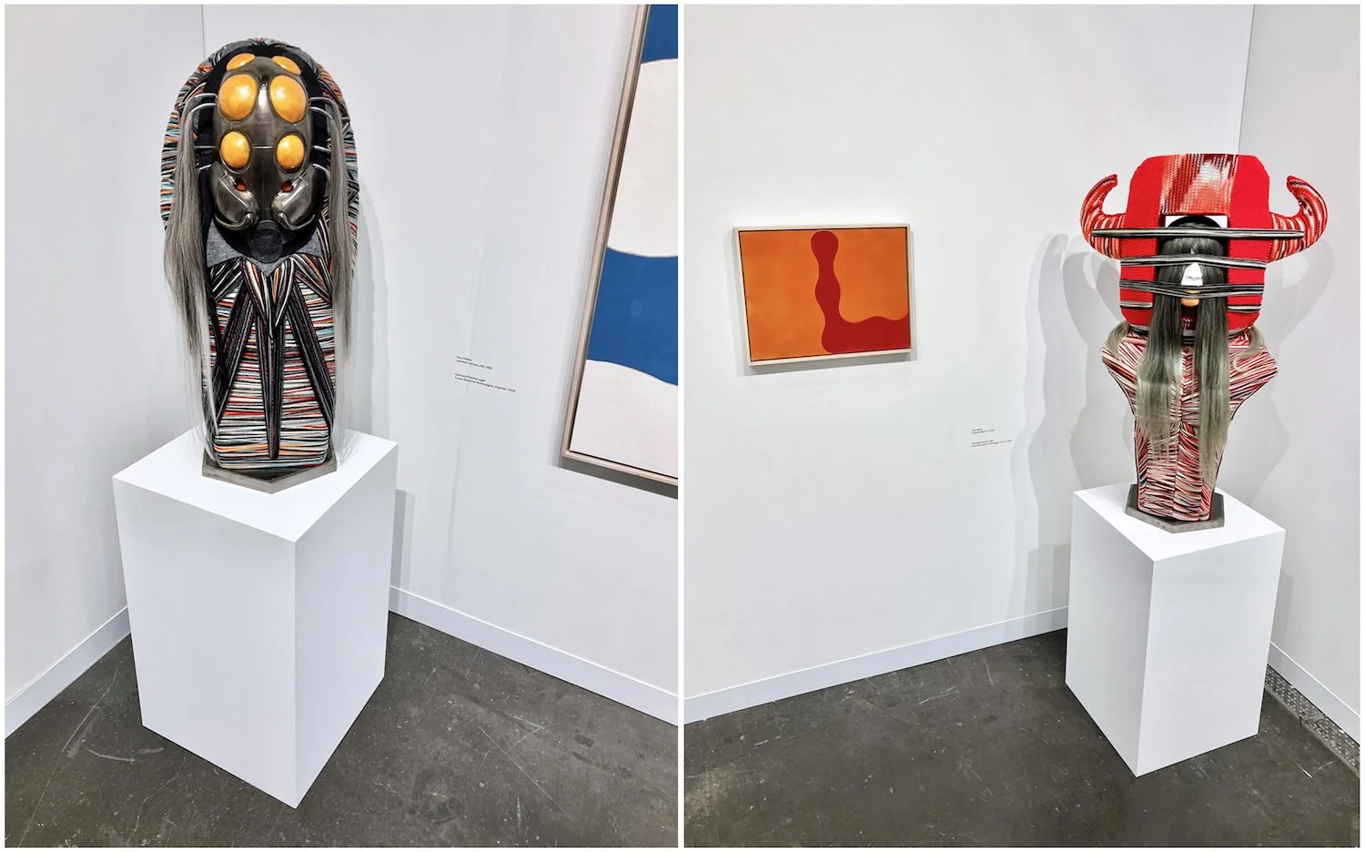
It was back to the future at Garth Greenan Gallery with their perfect combination of works by Cannupa Hanska Luger and Paul Feeley. These late works of Feeley, created just years before his death, were inspired by large-scale calendar pages given to him by his wife to keep a visual diary of his work. They are equally serene yet rhythmic, paradoxically balanced yet imperfect. His archetypal library of shapes in the form of balustrades, jacks, and rounded squares recall the past and point to the future, as with Cannupa Hanska Luger’s ongoing series, Future Ancestral Technologies. His three mixed media sculptural busts—Engineer, Guide, and Oracle—time travel through interconnected explorations of science fiction theory, storytelling, Indigenous technologies, contemporary materials, and the detritus of capitalism while addressing various phobias, landscapes, and prototypical new mythology. They emit a conjuring sense of power, playfulness, and totemic ritual in their use of animal and insect forms, yarn, and hair. I couldn’t help but fantasize about these characters in a battle dance with Rammellzee and Sun Ra. Energizing everything it comes in contact with, Luger’s work kindly pushed the view of Feeley’s paintings toward a new and invigorating vantage point.
Hales Gallery featured the work of Jordan Ann Craig, who lives and works in Sante Fe County, New Mexico. Her large-scale paintings, formatted primarily in grid structures, utilize color, pattern, and interlocking forms in an exploration and interpretation of Northern Cheyenne and Cheyenne material culture while putting forth questions and creating a dialogue with modern abstract painting—most directly that of Agnes Martin—and its relationship to Indigenous culture. Craig’s line and pattern work appear to be more academic and consciously scrutinized, surgical in comparison with the soft and unplugged ethereal quality of Martin, hinting to Craig’s research-based practice that begins in museum collections and archives.
A large portion of the core galleries at the front were easily passable. The real party started at the back of the fair. In the Not-For-Profit section, I sparked a great conversation with Gavin Kennedy and the team at Fine Arts Work Center from Provincetown. It was their first time doing the fair, and their excitement was invigorating. The artist-led organization offers yearly residencies to a diverse selection of visual artists and writers from across the globe. Some highlights from their booth were artists Lisa Yuskavage, Taylor Baldwin, Arghavan Khosravi, Herman Aguirre, Anne Clare Rogers, and Amy Brener. One of their former fellows, Anina Major, whose installation, The Landing, featured in the Platform section of the fair, curated by Eugenie Tsai, had won the annual Pommery Prize of $25,000. Major is from the Bahamas and is represented by Tern Gallery in Nassau. The multimedia presentation includes ceramics inspired by her grandmother who was a Straw Market vendor. The installation includes a spinning neon sign and a dock-like platform constructed of wood palettes. Her decaying pots memorialize the dying art of straw craft and critique the systems that fuel its demise.
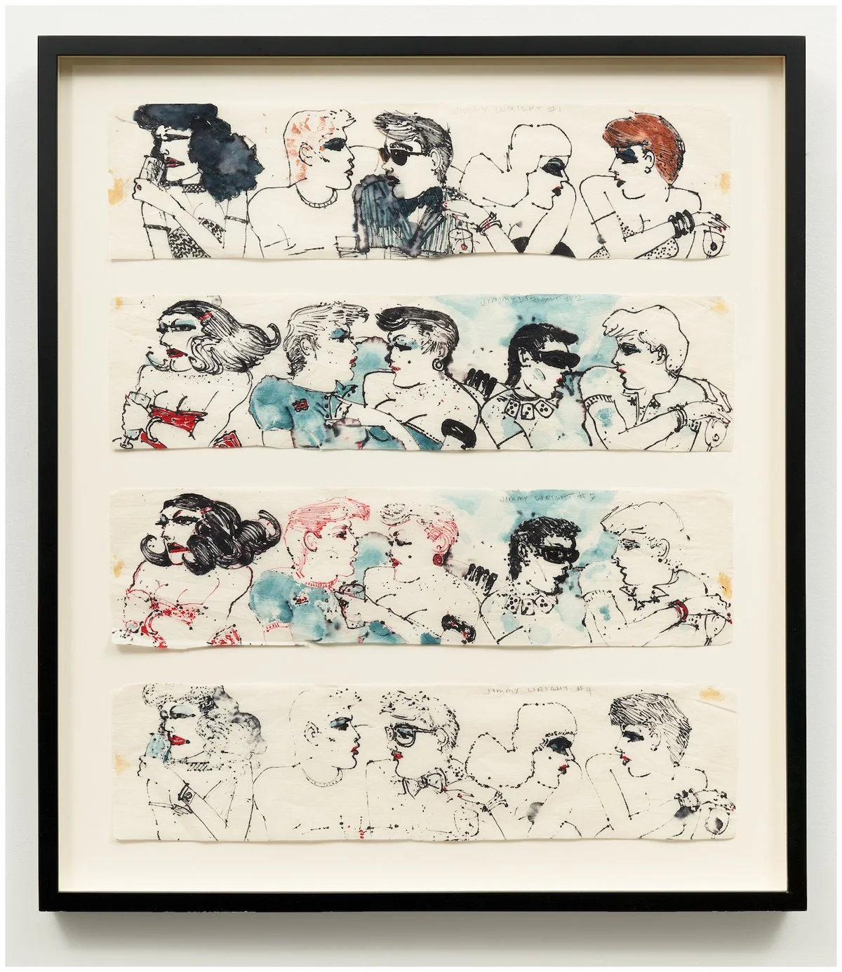
The strongest and most fun area of the fair was without a doubt the Focus section, titled Passages, wonderfully curated by Robyn Farrell. Nodding to the fair’s earliest days, this section felt refreshingly more about art than commerce. The combination booth of Corbett vs. Dempsey and Fierman featured the fabulous work of Jimmy Wright, who documented the flourishing queer landscape of Manhattan’s gay bathhouses and bars like Max’s Kansas City, Club 82, and The Anvil beginning in the 1970s—post-Stonewall and pre-AIDS epidemic. The spirit of these pieces is something that I am continually on the lookout for—a sense of being lived in, as opposed to being strategized or conceptualized. There is an undeniable authenticity that comes with this type of commitment to occupy one’s own time and creativity, fully and unapologetically. I enjoyed chatting with Jim Dempsey in the booth, who was initially unsure about the placement at the rear of the fair, but then likened it to being in the kitchen at a great house party. I assured him that the party for this fair was indeed in the back.
Finally, I was thrilled to see new works by Hector Dionicio Mendoza, represented by Luis De Jesus, Los Angeles. His show-stopping work delves into a world of Magical Realism, taking inspiration from oral histories, ethnobotany, and personal experiences learned from his grandfather’s practice as a fifth-generation curandero (shaman). There are references to labor and kinship with materials of the natural world—earth, tree bark, flora, and feathers and materials related to labor like corrugated cardboard, cement, glass, and cinder blocks, as well as, found and recycled objects. His ethereal forms, reaching and in flight, serenely emerge and cascade from the floor and walls, backed by a lush backdrop of black, white, and grayscale foliage and vine. The installation was perfectly balanced and staged, poetically in dialogue with both the formality of the booth and the crisscrossing ceiling rails of the Javits Center, his forms tenderly and blissfully disconnected from the cage of commerciality that all artists and dealers must find ways to navigate. It’s appropriate symbolism as The Armory Show forges ahead into its new era.
Edited by Xuezhu Jenny Wang


