
Envisioning Breath: Recording Air Pollution Through Clay Forms

Breath Atlas. Abigail Regner, HK Dunston, Mariya Chekmarova, and Jill Sigman. 2025. Image courtesy the artists.
Multidisciplinary artists and data scientists Abigail Regner, HK Dunston, Mariya Chekmarova, and Jill Sigman collaborated on Breath Atlas (2025), a body of ceramic forms that visually represent data relating to air pollution and social determinants of health in New York City neighborhoods. Breath Atlas visually represents rates of poverty, air pollution, green space versus polluting space, child asthma, and incarceration across 10 different neighborhoods. The resulting work visually represents this data and highlights the air quality and health disparities among New York neighborhoods.
Breath Atlas was recently on view at BRIC House Gallery as part of the 2025 Data X Design “Corpus: Bodies of Data” exhibition. I sat down with two of the four creators, Abigail Regner and HK Dunston, to discuss the process of building Breath Atlas and to talk about the project’s aspirations and next steps.

Data sheet showing metrics across various neighborhoods. Process image of Breath Atlas. Image courtesy the artists.
Meinzer: I want to start from the beginning and talk about how you got the idea for this project.
HK Dunston: Mariya Chekmarova and I participated in the 2020 Data X Design exhibition together, so when I saw the call for entries late October last year the idea just popped into my head. I emailed everyone and was like, “Hey, would you be willing to help me put this together?” The idea for me personally came from what I studied in grad school. I focused on the need for climate adaptation and the impact of environmental justice. I spent a lot of time looking at transit and the negative cycle of side effects that comes with transit being centered around cars and trucks rather than public transport and non-polluting transportation.
From there, the idea of breath naturally emerged: What does it feel like to breathe? There’s a strong contrast between New York and other cities like Paris and Copenhagen that have spent a lot of time, money, and policy on sustainable transportation in a way that the US hasn’t.
M: What is New York doing to combat air pollution?
HKD: There actually has been enormous progress. In 2009, a law came into effect that required buildings to change from fuel oil to gas for heating and hot water. Buildings have had a certain runway to convert. The effect of that has been very positive over time.
Car emissions have been improving: California, New York, and other states have enacted emission standards. There’s been a focus on peaker plants, which are an intense source of pollution. They kick in during periods of high energy demand—usually in mid-summer when the heat is at its worst. The problem is that these peaker plants are almost always in environmental justice neighborhoods—areas that have been treated as sacrifice zones. There’s a big push to convert at least some of them to battery storage rather than gas-generated energy.
People are focused on it, but what they haven’t been as focused on are the social determinants of health. Take Chelsea, for example. While there’s still pollution, the children don’t have severe asthma (as measured by emergency room visits) because people there have doctors, can afford medications, and can take their children to clinics. So while there’s been incremental improvement in healthcare methods, the fundamental approaches haven’t been truly actionable.
M: How were the neighborhoods from Breath Atlas selected?
HKD: Each neighborhood has a story behind why we chose it. Mott Haven and Hunts Point have truly been treated as sacrifice zones. In Mott Haven, about 500 out of every 10,000 children have gone to the ER at least once for asthma—that’s a huge number.
But not all neighborhoods have that specific story. Tompkinsville in Staten Island is where Eric Garner was murdered. Elmhurst is where Elmhurst Hospital is located, which was the focal point of the pandemic in 2020. Each neighborhood was selected with a specific narrative in mind.
Process image of Breath Atlas. Image courtesy the artists.
M: Did a lot change between the project proposal and the production process?
HKD: It was pretty decided what we were going to do when we proposed. We didn't have a lot of time to start again—we just had to go. It was just swift decision making. But it also just kind of fell into place.
Abigail Regner: But we also had a lot of discussions—we would sit for hours and talk about the implications of this metric versus another. The data set we used had something like 100 variables. There was a lot of deliberation and criticism amongst us. We were very critical about what we were doing because we wanted to make sure that it was effective.
M: I think it comes across as very clean, because every decision is so intentional in a way that does lend itself to the legibility of the project. Abby, could you talk about the building process?
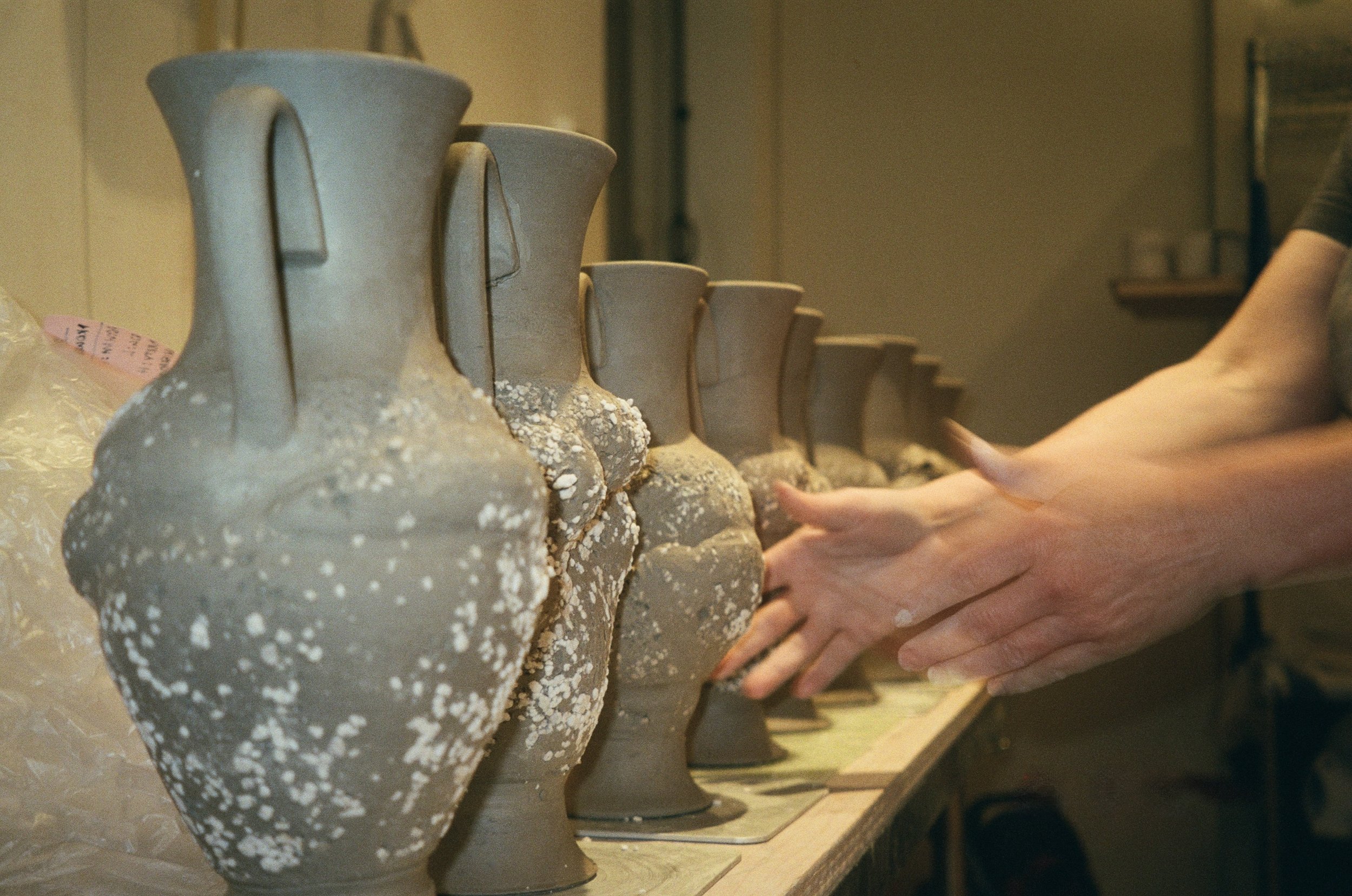
AR: Sure—what we wanted was a form that evoked the body because we’re talking about our experience in our bodies as New Yorkers, as people who live here. So we decided on the amphora because it has these distinct body parts that I think are subconsciously, or consciously, relatable to our body parts. There’s the neck, the lip, the handles, the body, the foot. They’re distinct parts, but they come together to make a whole form. We felt it would be a good way to represent the metrics, because each metric not only impacts breath, but also impacts different parts of our bodies.
There were a lot of aesthetic decisions that we had to make to support what we were doing, and with that came technical challenges to overcome because we had to make them in four separate pieces for each form. We had to discuss how standardized we wanted each form to be, and that part of the big debate—how unique we wanted them to be per neighborhood. We came to the conclusion that it was important that they all followed the similar structure, so we were trying to tow the line between standardization for the sake of communication while also trying to leave a bit of room for nuance and interpretation with the form.

Collecting pollution at the George Washington Bridge. Process image of Breath Atlas. Image courtesy the artists.
M: Let’s talk about how pollution was used to glaze the forms. You didn’t know it was going to work—did you have this idea from the beginning?
HKD: I came across a group of ceramicists in Rotterdam who had collected pollution and fired it. But who knows what they did—it’s not like we had a guidebook.
AR: We chose the George Washington Bridge because it has the most car traffic in the world. We didn’t really know what we were doing, but we just went to the bridge and saw lots of black sediment. We collected the black sediment using rib tools, sponges, and water, and the black sludge settled at the bottom of the bucket of water. Then we siphoned off the water and mixed the sludge with glaze, testing it to see how it reacted inside of glaze, on top of glaze, raw, without any glaze. After that first firing, it came out very dark. It was a huge moment, because we realized that it survived over 2000 degrees Fahrenheit, which means that there’s metal in the air. Then we just kept testing from there.
HKD: We got more information about the pollution after tracking down a professor at NYU Grossman School of Medicine who studies this material in particular. There’s different kinds of air pollution and they’re classified by the size of the particle. So there’s PM 2.5 which is the stuff that's really, really bad for your lungs because it’s so tiny—it’s invisible. Then there’s PM 10, which is what we think we have. It’s mostly a bunch of carbon that’s coming from vehicle emissions. All of the trace metals are things like brake linings, wear from tires, the corrosive motion of an axle turning as a truck goes by.

Applying pollution to the forms before glaze firing. Process image of Breath Atlas. Image courtesy the artists.
M: Can you speak to the logic behind the visual representation of the data that Breath Atlas presents?
AR: We discussed several different ways to represent child asthma, which ended up being my favorite part of building these. We decided to squeeze the clay body, constricting it. We were debating how much to squeeze them, how we would squeeze them, and what that would mean conceptually for the work. At one point, we had thought about blowing into the form to let them expand while they were constricted. We ended up using a string to squeeze them.
But the thing that I loved about the creation of this was that we all had to be working on it together. I loved that we all worked on each piece together—two pulling the string, two holding the body. We were all physically involved in the creation of each piece.
HKD: Metaphorically, for the representation of poverty, we rolled it in perlite and paddled it, which compressed the clay and pushed the perlite in. There was a kind of violence to the production process.
M: Each of the forms has undergone a lot of stress.
AR: Yes, exactly. Jill Sigman, who’s a performance artist, helped us think about how our bodies interact with the pieces, encoding metaphorical content into the work.
HKD: The experience of throttling the piece feels like you’re choking it, constricting its capacity for breath.

Squeezing the form. Process image of Breath Atlas. Image courtesy the artists.
AR: I think the biggest debate was the handles—thinking about how we were going to represent incarceration. We went back and forth on all these different ideas. We didn’t want these pots to seem broken or defective because we didn’t want to represent the neighborhoods like that. And, at the same time, the broken handles represent the absence in these communities and the neighborhood.
HKD: That’s the biggest challenge that we had. There’s a whole aspect of the neighborhoods that we spent a lot of time researching and thinking about but struggled to introduce to the forms in a way that’s legible. We wanted to identify and represent the moments of resistance. The resistance in the neighborhoods is very present and very important—in Brownsville, there are twenty-seven community gardens, compared to two in Chelsea. The patterns of neighborhood resistance and mutual aid are a huge chunk of information that we just couldn’t figure out how to represent, and that’s a real regret.
M: I feel like there’s space in the project to build that, especially in the way that you’ve done the descriptions of the neighborhoods and the accompanying website.
HKD: We had all sorts of ideas, like audio clips of people from each neighborhood. We thought about finding a community garden in each neighborhood and taking cuttings to put inside the pieces, but they’re not open until a few weeks from now. If we continue to build on this project, the thing to think about next is how to show the resistance and resilience of the neighborhood. Currently, the project is very much a bird’s eye view.
M: I think the project has so much room to grow. I’m excited to see where you take it.
HKD: Yeah, finding ways to represent the neighborhoods and bringing in conversations from the neighborhoods are definitely a big part of what we want.
Another important part of the project is that the meaning changed during the course of the project in a way I really didn’t expect. If you think about quantification as a state power, the current administration is throwing away that power with both hands. We were thinking about how pottery, throughout history, has been used to understand ancient civilizations. Breath Atlas is a record, which can be a form of resistance in preserving and recording literally what’s happening while public health labs across the country are getting shut down.

Melrose, Mott Haven, Point Morris amphora. Breath Atlas. Image courtesy of the artists.
Breath Atlas was on view at the 2024 Data X Design Exhibition from March 21 to April 6, 2025.
Edited by Jubilee Park